
As a photographer, I need a tool that fits my art perfectly, that I can control completely, and also allows me to display my pictures the exact way I want–without any limits of size, quality or design. This tool is my WEBSITE. I made my website from Adobe portfolio because it came with my Lightroom subscription. My website will showcase my best shots and help me to establish myself as an expert in my chosen field. A website is also meant to capture attention from people–and from Google–and get me more clients.
At the beginning of this module, the website I had was a mixture of my two different work – It was mixed with my wedding photography and my fine art photography. After the first semester, I was advised by my tutors to separate my two different work.
14/01/2019 – This is the overview of how my website looked like before I updated it. It is a mixture of different kinds of photography work – wedding, street portraits, personal street photography work and documentary photography from my university work.


Learning from my mistakes when I made my first website, one thing I need to do is organise the information I need to include on my website.
I realised that I shouldn’t put all the information on one page. One thing that helped me organise my thoughts is to focus and always put in mind that a good website for artists is like a gallery or museum. The artwork can’t be stacked, overpopulating the walls. It’s best to give each item space to breathe, whether it’s an artwork or text. Organising my artist website with pages (properly & minimally) is the best way to do this.
For my updated website, each page should have only one purpose (with an exception of my about me page which also serves as my contact page). By putting too many pieces of information (or art) on one page, my website visitor will lose interest.
Not only is this the clearest, most user-friendly way to organise my website, but it also helps with something called SEO (Search Engine Optimisation). SEO keeps my page at the top of the search results whenever anybody uses Google, Yahoo or any other search engine.
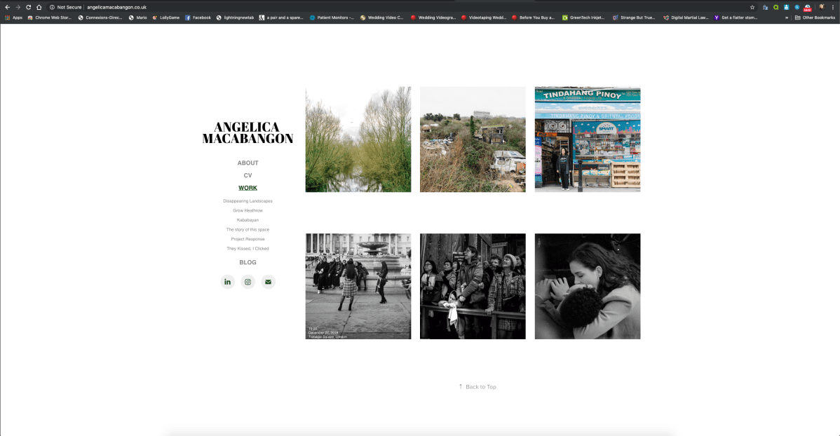
I first decided what layout I would like my website to look like. I want my website to have this coherent look with Instagram – grid style, square.
SO WHAT PAGES DO I NEED?
1. Home / Landing Page – This is important because this is the “face” of my website.
2. About page – This is where people can find out about me and my work.
3. CV – This information is particularly useful because I am using my website as my portfolio.
4. Work / Gallery – This is the centre of my website, where visitors will be able to discover my images. I made sure I only include photos that represent the kind of photography I am interested in.


I also removed my wedding photography logo and only replaced it with my name because, in an artist website, I noticed that you are your brand already and you don’t really need a logo.
WEBSITE BEFORE AND AFTER
1.) I started editing my about me page by cutting all the unnecessary. I also noticed that in my website before, my about me page focuses on getting wedding photography clients. In my updated about me page – I prefer to write a brief statement about myself because I find it more ‘powerful’/effective than including a full bio of myself. The first person to the third is best-written statements–as it makes things more intimate, and readers will be more inclined to empathise and contact me. I also opted to add a self-portrait of myself because it adds personality and a humanising element to my website.


2.) This is a before and after screenshot of the WORK / GALLERY PAGE. I used to have a very cluttered or mixed work page – consisting of wedding, street portraits and personal work images. But in my updated website, I’ve really thought about the work that I included because I only want to show work that best represents me as a photographer.


3.) The first screenshot is what my contact page looked like before. The second image is from my updated website. My separate contact page is now my CV page. Including this in my website will help me, when applying to galleries, museums, competitions, or commissions.


UPDATED WEBSITE
After all that website renovation, This is what my website looks like now. I am very happy because I can now say that my website is definitely how I wanted it to look like in the first place. I showed it to family and friends and I’ve been told that it now looks so much organised and definitely helped raise the standard of my work.


