CV |Personal CV’s / Creative CV’s

When applying for a job, making a strong impression is a huge challenge, but it can make all the difference. Creating a curriculum that stands out from the crowd is one of the best ways to improve your opportunities for employment. The purpose of this document is to tell employers everything they need to know about their qualifications, skills and working history in a concise and elegant package. Many employers value more than almost any other aspect of the information collected from a CV.

Before, I only knew how to make traditional CV’s not until after our creative CV’s for artists workshop in Uni.

I only have a traditional CV, but before making an artist CV, I had to look up some inspiration from other creatives on how they make their CV’s and stand out from the rest.

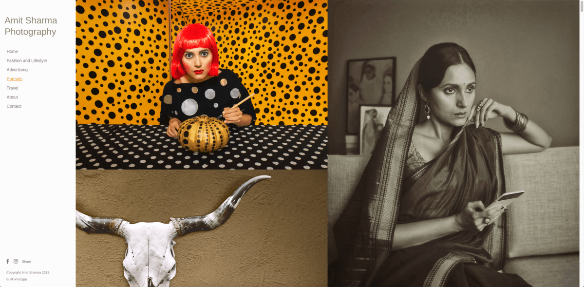
1.) Some may argue it’s not creative at all. But I found it creatively minimal. I love the “MIKE” letter layout and the large, yellow title font on the background. His social media along the page’s footer stands out strikingly well compared to other resumes that just put all contact information in the header or footer.

30-creative-resumes-norrington-615x831

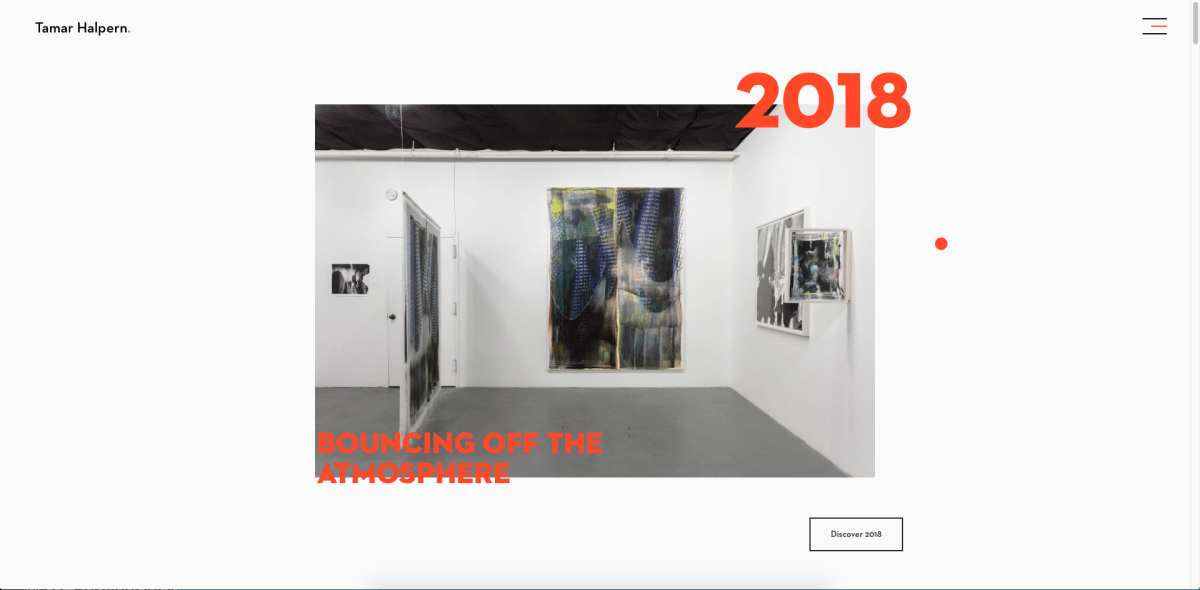
2.) The size and fold of this CV is fantastically creative, and this artist does an excellent job of creating such intriguing CV and really putting into consideration on how you would open it – it leads to the next page. I like it very much because it’s definitely unique.

12-creative-resumes-amber-615x408

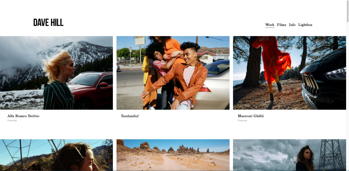
3.) This artist’s CV design adheres very well to the look of her brand. The whole design is clean and organized, easy to navigate. However, it still looks pretty and shows her abilities in graphic design. She mentioned everything in a humble manner and you can extend the CV to the bottom.

20-creative-resumes-callens-615x871

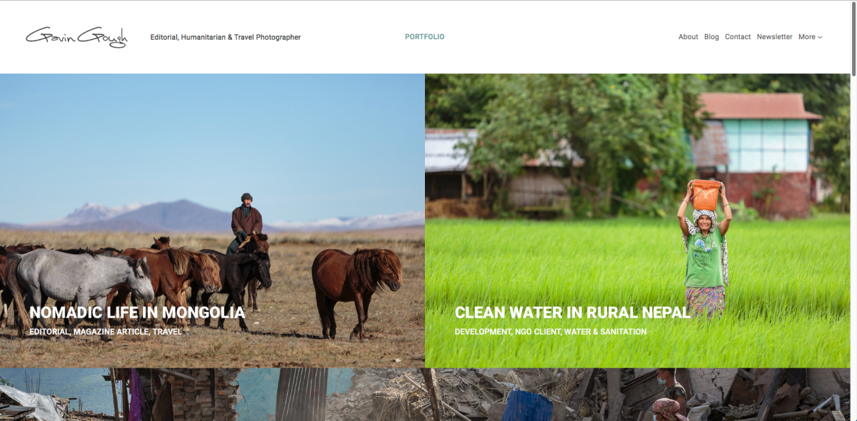
4.) I love how this creative CV organises so much content to one page. It’s almost overwhelming at first glance, however, lines and other graphics can easily draw your eyes from section to section. It shouldn’t take very long for the viewer to go through so that every section and detail is connected to the next and everything should be shown in an expressive and creative way. If I were to make my own creative CV, this is the look that I want it to have.

21-creative-resumes-shetty-615x950


Non-traditional resumes aren’t for everyone. They can, however, be very beneficial for certain types of job applicants. Non-traditional resumes are ideal for job seekers in creative industries like marketing and design. Specifically, online resumes are helpful for applicants wishing to post films, sound clips, photographs, or other work related to their industry.

But according to a study by The Creative Group reports that 70% of employers preferred traditional resumes (PDF/Word) even for creative jobs. Only 20% were interested in infographics, and fewer preferred a social or online profile (4%) or a video resume (2%). 

Hence I personally prefer to have both kinds of CV.

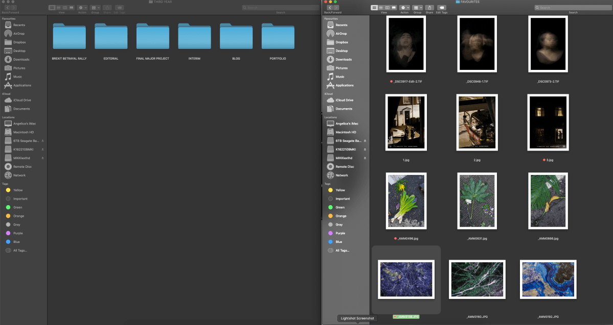
Here is my Traditional CV and my creative CV.

Screen Shot 2019-05-22 at 14.08.24

Nontraditional resumes are also helpful for people without an extensive work history. They allow candidates to emphasize skills rather than their chronological work history.


RECAP | DIFFERENCE BETWEEN A CREATIVE CV AND A TRADITIONAL CV

TRADITIONAL CV

-Chronological order

-A bit more loaded with information

-Little to no colour or design

CREATIVE CV

-Visual communication

-Colours, graphics, logo, photo

-Clean, easy to read


I’d also like to mention that in creating a CREATIVE/ARTIST CV for Photographers, it is important to include:

1.)Statement- A short one. Briefly state what your practice is all about.

2.) Include commissions work, exhibition experiences, projects and other relevant stuff

3.) Mention your education.


The important thing that I had to bear in mind when I created my artist CV is to make it relevant to my industry. Also, I can be creative as much as I want. However, for my traditional CV, I’d stick clean layouts and simple designs.


CVs for Creative Careers

https://www.visualcv.com/examples/photography/

https://www.myperfectresume.com/how-to/cv-examples/photographer-cv-example

Click to access creativecvguide(1).pdf

INSTAGRAM | Artist inspo

Instagram is one of the most popular platforms for social media. Today, with over 800 million users, curated Instagram feed matter for every brand out there. Well-selected images and content are like a digital mood board for your followers on your Instagram feed. It gives them a sense in a matter of seconds of what your brand is all about.

KYLE MCDOUGALL & ANTE BADZIM

I believe on this blog, I have mentioned a couple of times that I really like the minimalism/organised look – may it be on a website or on an Instagram feed. Kyle Mcdougall and Ante Badzim’s Instagram accounts are the epitome of the words: aesthetics and minimalism.

Choosing a color scheme is an important aspect in curating an instagram feed. Mcdougall and Badzim’s feed are the perfect example for this. They use pastels colours as the base colour and move from one (or two) highlight color to the next (especially noticeable on Badzim’s feed)

Mcdougall uses white borders  and it is a brilliant stratagy for cleaning up an Instagram feed and adding some polish and a crisply minimalist atmosphere, while reflecting on some favorite or key photos.

Each individual photograph works for itself visually, but the image of the tiles taken together also makes a compelling whole.

In regards with the photo they post, Mcdougall posts landcsape and Badzim does the same but including other elements on his photos too.  They are using their instagram as a mini portfolio because they only stick to posting final images on their feed rater than including the “behind the scenes” images.

SPENCER MURPHY

Spencer Murphy’s Instagram aesthetic is pretty much the same with the first two artists That I have mentioned. He is also very aware about the colour scheme of his feed and the way his photos are presented/posted. Just like Mcdougall, he uses white borders- another good thing about doing this is that it makes his photos stand out more and anyone who lands on his feed will likely notice that every photo.

One thing I like about his account is that, he doesn’t only post final projects but “potential” final projects as well. He uses his instagram as a low functioning blog, which is great and very informative too.


GUY MARTIN

Like Spencer Murphy, Guy Martin definitely uses his Instagram account as a low-functioning blog. You can tell on his feed that it’s quite mixed-with his documentary and behind the scenes picture. I noticed he was also making real use of his instagram story and sharing a lot of stuff behind the scenes. I personally appreciate that when he decided to make his book, he shared the BTS. As a follower, I really appreciate accounts like this because they’re not just posting great content where I get inspired, but educational as well.


Instagram has potential for your brand/business and it requires hard work to get the maximum benefit. While there are a lot of tools out there that can simplify the curation of content, human involvement remains the most crucial factor for success.

You need to individually asses content and curate Instagram feed that will help you build a warm relationship with your audience. You also need to find the right mix between content creation and curation to enhance your online presence and eventually turn your brand into an industry influencer.


10 Tips for Photographers on Instagram

How to Create a Cohesive Instagram Aesthetic


EXHIBITION VISITS

Deutsche Börse Photography Foundation Prize 2019 | The Photographers’ Gallery

In each room, the viewer is immersed in the expert documentation of the artist. Viewers are encouraged to do more than just watch the photographs; instead, the emphasis seems to be on more thorough understanding of the subject.

One of my favourite was the nucleus of Laia Abril’s abortion history is a beige flowered chair facing a television set from the 1960s, the two objects that invite you to sit down–but to do so would face you with a series of clips from polemical anti-abortion speeches, obscured by the blueish and jittering glass screen. However, we are reminded that they are by no means history when looking at the dates of information given on the walls–2005, 2014, 2015–words stinging in the ears when experienced in conjunction with sensitive portraits of people affected by their country’s lack of abortion rights. One woman attempted to induce her own domestic abortion to’ feel stronger than the law.’ These are juxtaposed with scientific photographs of objects associated with abortion history; a condom of fish bladder, ancient acid contraceptives, an unlawful kit of instruments. Here there is an excellent balance of thorough historical documentation, with testimonials from people who have undergone an illegal procedure as well as a woman who has performed thousands of them, and an angry exposure of the emotional and physical harm that stringent laws can have on women.

Arwed Messmer’s focus is on the RAF (Red Army Faction, a far-left student militant group) operating during the German student protests of the late 1960s, driven by the poor living conditions of the students at the time and the West German government’s impression of limiting political freedom, and then fuelled by police brutality. His is the first room, a collage of images primarily from press archives, including an enormous photograph of several figures gathered around a student’s body. No one looks in the same direction on every face that is not turned away, portrait-worthy emotion. There are members of the RAF along the left wall as you enter, each figure taken in sharp isolation from the mass protest, their costumes look almost comical, insincere, but it is their full expressions of pride, fear or youthful trust that denote the gravity of their situation.
In a slideshow compiled by Susan Meiselas, a member of Magnum Photos since 1976, she writes as part of her long-term work Kurdistan / akaKurdistan, “It felt weird–photographing the present when I knew so little about the past.” As a viewer, this strange feeling, looking at so much history potted in one room, is also easy to get. Some of the most striking photographs in the exhibition are those of clothing marking the tombs of Kurds instead of gravestones; crumpled like on the bedroom floor of a teenager, giving a haunting reminder of our material possessions’ ability to endure beyond the fragility of human life.

In previous rooms, photographs are generally populated with figures interacting with the world around them, but all the work of Mark Ruwedel shows a profound absence. (This work pretty much reminds me of my ongoing project disappearing landscapes.) Slight evidence of the presence of human, all in black and white, soaring landscapes. The Dusk series feels like some kind of post-nuclear wasteland–moving along the line of images along the wall of abandoned houses sitting on the plains of North America – places where human presence has broken down and moved away. These pictures are the timelessest of all. Ruwedel wrote that he is particularly’ in those places where the land reveals itself to be both an agent of change and a field of human endeavor’ –the landscape stretches across concrete tunnels and pulls down houses, a life cycle that we can either accept or resist, but the energy persists.


JENNY HOLZER | TATE

When you enter a Jenny Holzer exhibition, the first thing you see is text. The new Tate Modern display is no exception–the exhibition entrance is a small, high-top empty room, except for walls full of repeated phrases and wandering readers. One sentence reads “SYMBOLS ARE MORE MEANINGFUL THAN THINGS THEMSELVES,” and reading on, it becomes increasingly apparent that Holzer could not possibly mean bold statements. Instead, they’re just there to provoke thought, or at least reaction.


NAN GOLDIN, The Ballad of Sexual Dependency |TATE


INSTAGRAM | Updated

A lot has changed in the world of photography. Some photographers hate the changes and suffer while others take advantage of the changes and grow their business.

Instagram has changed photography and how the world sees the medium.

Here are the screenshots of my Instagram account at the beginning of the module – 14/01/2019.


I personally use Instagram even before I made this separate account solely to showcase my photographic work.  It is a great place to get –some— exposure and builds up an easily ‘consumable’ portfolio. Instagram is also a great tool to use because it “backs up” my website. It functions as a low maintenance blog and I use it as a marketing platform for my photography.

With my Instagram stories, I make use of it to show behind the scenes, rather than posting it on my feed.  I try my best and make sure it looks good and try to stand out. Be different.


INSTAGRAM BEFORE AND AFTER

This is a before and after screenshot of my Instagram account. I made a couple of changes here.

1.) I changed my profile picture so it is the same with the photo I have on my website.

2.) I changed my description. Before it is quite loaded with information – including my personal account (which is not really necessary), and the information are quite vague.

for my updated Instagram, I want to be more straight to the point (Photographer |Documentary | Open for collaboration)

I also included a link from Dazed and confused, where my work got featured.


3.) Captions – Instagram has become a platform to tell visual stories, so I make sure my post is accompanied by an interesting title or story to encourage your followers to engage in it.

4.) Using Hashtags on Instagram – A very important way to engage with my followers and attract more people to my Instagram is to effectively use hashtags.

Instagram allows up to 30 hashtags per post, but it’s common practice to use between 5 and 12. BUT I personally ‘abuse’ the use of hashtags and put the maximum in each post.

Apparently, overusing hashtags will come across as “spam-y” to some hence result to decrease followers but I personally don’t see anything wrong with it as long as you use it effectively and not only put random hashtags.


5.) Instagram stories – It’s Instagram’s latest feature which allows you to share pictures and videos that, similar to Snapchat, will disappear after 24 hours.  This lets me share images with my followers that I don’t want in my feed.

Before, I don’t make use of this feature and only focus on my feed. But now, I try my best to use this feature as much as possible because it is very important for this business and it also helps with the engagement with my followers.

I use my Instagram stories for my:

  1. Behind the scenes
  2. My locations
  3. Stuff I do when not working: examples are artist studio visits/gallery visits
  4. Research: sharing updates about the current project I am working on.


 UPDATED INSTAGRAM ACCOUNT

Screenshots of my updated Instagram account


If you are like me who uses instagram as a mini portfolio, it is good to have a “theme” and stick to it because for me, you are not only creating an account, you are creating a story at that time. You’ll stop and think about every picture you put out there because building an Instagram theme is a great way to keep your branding visually consistent.


WEBSITE | Revamp

As a photographer, I need a tool that fits my art perfectly, that I can control completely, and also allows me to display my pictures the exact way I want–without any limits of size, quality or design. This tool is my WEBSITE. I made my website from Adobe portfolio because it came with my Lightroom subscription. My website will showcase my best shots and help me to establish myself as an expert in my chosen field. A website is also meant to capture attention from people–and from Google–and get me more clients.

At the beginning of this module, the website I had was a mixture of my two different work –  It was mixed with my wedding photography and my fine art photography. After the first semester, I was advised by my tutors to separate my two different work.

14/01/2019 – This is the overview of how my website looked like before I updated it. It is a mixture of different kinds of photography work  – wedding, street portraits, personal street photography work and documentary photography from my university work.

Learning from my mistakes when I made my first website, one thing I need to do is organise the information I need to include on my website.

I realised that I shouldn’t put all the information on one page. One thing that helped me organise my thoughts is to focus and always put in mind that a good website for artists is like a gallery or museum. The artwork can’t be stacked, overpopulating the walls. It’s best to give each item space to breathe, whether it’s an artwork or text. Organising my artist website with pages (properly & minimally) is the best way to do this.

For my updated website, each page should have only one purpose (with an exception of my about me page which also serves as my contact page). By putting too many pieces of information (or art) on one page, my website visitor will lose interest.

Not only is this the clearest, most user-friendly way to organise my website, but it also helps with something called SEO (Search Engine Optimisation). SEO keeps my page at the top of the search results whenever anybody uses Google, Yahoo or any other search engine.

I first decided what layout I would like my website to look like. I want my website to have this coherent look with Instagram – grid style, square. 

SO WHAT PAGES DO I NEED?

1. Home / Landing Page  – This is important because this is the “face” of my website.

2. About page – This is where people can find out about me and my work.

3. CV – This information is particularly useful because I am using my website as my portfolio.

4. Work / Gallery – This is the centre of my website, where visitors will be able to discover my images. I made sure I only include photos that represent the kind of photography I am interested in.

I also removed my wedding photography logo and only replaced it with my name because, in an artist website, I noticed that you are your brand already and you don’t really need a logo.


 WEBSITE BEFORE AND AFTER 

1.) I started editing my about me page by cutting all the unnecessary. I also noticed that in my website before, my about me page focuses on getting wedding photography clients. In my updated about me page – I prefer to write a brief statement about myself because I find it more ‘powerful’/effective than including a full bio of myself. The first person to the third is best-written statements–as it makes things more intimate, and readers will be more inclined to empathise and contact me. I also opted to add a self-portrait of myself because it adds personality and a humanising element to my website.


2.) This is a before and after screenshot of the WORK / GALLERY PAGE. I used to have a very cluttered or mixed work page – consisting of wedding, street portraits and personal work images. But in my updated website, I’ve really thought about the work that I included because I only want to show work that best represents me as a photographer.


Screenshot 2019-05-11 at 20.03.38
AFTER


3.)  The first screenshot is what my contact page looked like before. The second image is from my updated website. My separate contact page is now my CV page. Including this in my website will help me, when applying to galleries, museums, competitions, or commissions.


UPDATED WEBSITE

After all that website renovation, This is what my website looks like now. I am very happy because I can now say that my website is definitely how I wanted it to look like in the first place. I showed it to family and friends and I’ve been told that it now looks so much organised and definitely helped raise the standard of my work.

WEBSITE | Artist websites

As an emerging artist in this modern world, I believe a professional site is essential. A website is an excellent place to keep your contact details and also create a portfolio of your work. The online platform improves the perception of your art’s professionalism. It enables you to build your reputation by giving people the chance to learn who you are as an artist.

In this post, I am going to review about artists’ websites that I have came across:

STEPHEN SHAW

Stephen shaw is a photographer based in Blackpool, specializing in semiotics, social documentary and portraiture, working in the street / documentary environment. His website is very “bold”-where red and black are the main colors. It’s pretty easy to navigate through his website-straight to the point and not much navigation, also the theme does suit his photographic work. The thing that doesn’t work for me is the font he uses. When you open his about page,  you can see paragraphs about him. Texts are red against black and it’s too spaced out, which makes it very difficult to read. But apparently at the very end, he mentioned that it’s supposed to contain a hidden message – which is quite cool.

Screen Shot 2019-05-17 at 11.35.44.png

TAKESA MATSUTANI

I like Takesa Matsuni’s website, it has this scrolling anchor links which is able to showcase his entire story in a single page. Long form pages like this one are becoming more and more common with the increased usage of handheld devices. One thing to note about this site is the small fonts used in certain sections. Although it adds a level of sophistication and elegance, it does make the content hard to read. This is a common trade-off that certain artists are willing to make.

Screen Shot 2019-05-17 at 13.54.38.png

AMIT SHARMA

Amit Sharma is a Delhi based photographer, working mainly in the field of lifestyle, advertising, and travel photography. The allure of his easy-to-navigate website are the stunning images he showcases in his scrollable image galleries. I personally like minimality look on a website. The thing that doesnt work for me is including a lot of photos in one project – his portrait page is overloaded with photos which makes the viewer lose atention and takes some time to load.

Screen Shot 2019-05-17 at 14.03.14.png

TAMAR HALPERN

Everything about Tamar Halpern’s website is unique, from the custom mouse cursor to the non traditional gallery layout. By not conforming to the traditional grid you see on most portfolio sites, Tamar is able to control how her story is told, one stunning image at a time.

Screen Shot 2019-05-17 at 14.45.40.png

DAVE HILL

Dave is photographer and director. His work is presented in a grid form. I personally like grid looks on a website, I think it just separate the work nicely but just like Amit Sharma, adding to much work doesn’t personally work for me.

Screen Shot 2019-05-17 at 15.03.36.png

GAVIN GOUGH

Gavin Gough is a Humanitarian, editorial and travel photographer.  The landing page of his website looks clean and inviting. He showcases his work in large grid style. I like how it looks minimal but packed with information as the same time. It’s one of those website that doesn’t leave you hanging.

Screen Shot 2019-05-17 at 15.21.14.png

THIBAULT CHARPENTIER

Thibault Charpentier is a travel photographer. I mainly thing I like about his website is the way he laid out his photographs – it is not a typical grid which still works very well with his photographs and he didnt include any texts – which he doesnt really need to.

Screen Shot 2019-05-17 at 15.20.26.png


I love his minimalistic approach, combined with the packed information website of Gavin Gough. They’re the inspiration behind my website.


There are many reasons why you, as an artist, need a professional website, but it is mainly because your website can be 100 %. You can easily build a website that represents you and promotes your work efficiently.


https://www.digitalartsonline.co.uk/features/creative-business/16-best-portfolio-websites-for-designers-artists/

https://www.steshaw.co.uk

https://www.takesadamatsutani.com

https://www.amitworks.com/portraits

https://www.tamarhalpern.nyc

http://www.davehillphoto.com

https://www.gavingough.com

https://www.thibaultcharpentier.com

INSTAGRAM | Take-over experience

Instagram is probably the one that produces the most trends among all the social media platforms. Instagram is a social network that keeps you wondering about the next big thing. It’s not so much about what’s new this time around, but rather what’s hot ‘right now’.

Although Instagram takeovers have been around for a couple of years, it is still pretty much in trend right now. An Instagram takeover is basically giving someone your Instagram account and letting them post content to it. It is an element of social media marketing that can help your brand or company gain exposure. Most Instagram takeovers are with people who have a similar audience to yours and are creators of content, influencers, bloggers or even employees. The takeover may take place for a day or during a special event, and may help grow your Instagram community and build brand awareness.

Here are some of the my favourite Instagram acc who frequently host Instagram take-overs:

This slideshow requires JavaScript.

I really enjoy checking their accounts and I like how because if it, I discovered a lot of artists whose works are what I like.


As part of the professional practice module, I was given the chance to do an Instagram take-over in our KSA.BA.PHOTOGRAPHY Instagram account. I was one of the first three to do it.

Let’s talk about PLANNING.

I have to be honest that I wasn’t able to equip myself enough with knowledge and techniques for doing IG takeover. I have read articles about tips when doing Instagram take-overs but I don’t think I have applied those well enough during my turn.

Another reason why I struggled because I’m not used to posting as much on Instagram and usually remember to do it quite last minute. Learning from this, I should have used an IG post planner next time to save me some stress.

As part of my curation planning during my take-over, I wanted to post work that best represents the kind of photography I want to focus on. I chose to upload 3 pics for each project and uploaded them individually rather than as a “group”.

My first post was my project response from a photography essay by JG Ballard (the one about food waste) and my second post was about the CCTV gaze and my last upload was from my interim project – documenting Grow Heathrow. My last post differs from my last first two project posts because I uploaded photos as a group – I wasn’t meant to do that in the first place because I was supposed to upload 2 more posts but failed to do so.

I have looked up different Instagram accounts from known organisations holding Instagram take-overs and what I noticed is that every post starts with an introduction – so people kind of know who is taking over, and then additional caption about their work to give the audience the necessary context about them and their work.. I guess this is like the standard thing to do during take-overs so that is also what i did with mine. I also included relevant hashtags to support my work.

OTHER ARTISTS:


MINE:

Screenshot_20190512-085843_Instagram


This is a screenshot of my personal IG story, during the last day of my take over. Although my take-over wasn’t really the best or didn’t really happened according to planned, I still enjoyed sharing my work with new audiences.  I also gained new followers during my take-over hence Instagram trend is really an interesting marketing tool for artists to use.

I posted this to thank the ‘account owner’ & also a call to action to for people to follow my account & their account.


Overall, content creation and execution can increase the bottom line of companies and brands wether you’re an artist or not. Instagram take over is one of the best way to expand your reach and build stronger relationships with a community or industry that is parallel to yours.


https://photoworks.org.uk/news/instagram-takeovers/

A Collection of Instagram Tips for Artists

https://marketingland.com/8-key-steps-successful-instagram-takeover-218549

PORTFOLIO

Untitled-1Untitled-2Untitled-3Untitled-4Untitled-5Untitled-6Untitled-7Untitled-8Untitled-9Untitled-10


========================================================================

In choosing the final 20 images for my portfolio, the first thing I did was to open my university folder file on my computer. I opened each folder that contains a project that I have done. 

I created one folder for all the images I think that is strong enough to be included in my portfolio. I didn’t mind how many I put there, as I will sort it out later.

I added approximately 60 photos on that folder.  I went through all the photos, one by one and I tagged (red) the ones that will finally be included on my portfolio.

The thing I considered while choosing my photos was how well my feedback was about that work. 

One thing I also noticed during culling my photos was, my work doesn’t really shine on its own. Actually, all of my work are part of a series – so what I had to do is to include 2 photos of each (strong) project response that I  have done.


Screenshot at Dec 15 07-46-27Screenshot at Dec 15 08-05-46


I also had to edit and print all my chosen photos this way, just so the viewers will understand my work better. I believe it works well like this rather than printing them individually.


Screenshot 2018-12-21 at 11.39.37.png


PHOTOGRAPHY COMPETITION ENTRY

These are some of the ongoing photography competitions I considered joining:

1.) World Photography Organisation

2.) Nikon Photo Contest

3.) BJP International Photography Award

But I chose to participate in the lensculture competition because the work I have done fits the theme of the competition.

Screenshot at Dec 12 23-21-37.png

Evidence of preparing work

For the lensculture competition, I really wanted to shoot something that’s documentary/photojournalistic style because that is the photography area I am most interested about. It was very timing that there was a Brexit Betrayal protest that was happening and so I decided to go and capture the event.

I took a lot of photos during the day and I do my photo culling on Lightroom as well as all my editing. I went through all my shots one by one and rated 5✫✫✫✫✫ to the ones I see that has potential to be submitted as my official entry/entries.

Screenshot 2018-12-12 at 22.49.45

I then filtered it so it’d only show my rated photos.. I edited them all in black and white – the reason is because there were too many colours in one pic and so I think the best way to deliver the message of the photo is to cancel out all the colours. In that way, the viewer will only be able to really just focus on the composition and overall story of the photo.

After editing them all in black and white, there were a couple of photos that really stood out for me but I managed to just choose my best 5.

Screenshot at Dec 12 22-57-56

I could not decide which one to submit so I did a poll on my instagram, asking my followers some help. By this time, I changed my mind and only wanted to let them choose my top 3 favourite. Here is how it went:

It was the first and last option that got the most votes.. but a lot of people private messaged me and told me that they really liked the message of the second photo.

I thought the poll would help me decide which one to submit but because of the response that I got from the people who participated in my poll, I got confused even more and so I decided to submit 5 entries!

So these are my 5 entries for the visual storytelling awards 2019 by lensculture


Screenshot at Dec 13 00-28-58

Also another reason why I decided to submit 5 entries is because I’d really like to get a feedback from the professionals, judging the competition.

This competition finishes on December 19, hence the results will not be known until 2019 and most feedbacks will be sent around April 2019.

Self evaluation

I have always been drawn to Photojournalism and documentary photography. Hence, for my entries for this competition, I decided to document the recent Brexit Betrayal Rally which happened last December 9, 2018. The protest was a really good situation to photograph as I was able to capture photos that I am happy to submit to the competition.

I was very challenged about this work not only because it was my first time to attend a rally and didn’t know what to expect, but it was also my first time photographing one. One of the challenges I faced was composing my shots, I was super challenged with that because small composition change can really change the story of a photograph and many times I struggled composing my shots because there were too many people and too many things happening all at once, it was a pretty overwhelming place/situation to be at.. but on the good side, I was really able to challenge myself – to create a story in a snap and  to try and find my own style in photographing these kinds of situation.

During editing, I was confused whether or not to edit my photos in black and white or leave it coloured. I have tried editing it in both but I ended up deciding to edit all my shots in black and white. The reason for this is because I just really want to let the viewer see the ‘details’ of my photos, in that way they can focus more on the story.

During editing, I marked my best 3 photos but I could not decide which one to submit. So to help me decide, I did a poll on my Instagram and Facebook story where I asked my followers some help. The total results made me even more confused because the 3 photos pretty much received the same amount of votes. I am glad I was able to use the social media platform because it also helped me expose my work and was able to get a good amount of engagement from fellow photographers and photography lovers.

Eventually, I decided to enter 5 photos to the competition. One of the reasons why is because I want to get feedbacks from the professionals. In this way, I am able to better my work next time, especially this is one of the type of photography I want to pursue.

Though this was just a very quick project, I still learned a lot from this experience. One of which was I learned that in situations like that, I don’t need to put so much pressure on myself trying to find the perfect composition and kept shooting – hoping that I’ll capture a good, well-composed photo. I realised that it was more effective to really just observe first, and when you see a great ‘story’ unfolding, and then you can start approaching/photographing the happenings.